ShopDreamUp AI ArtDreamUp

Deviation Actions


Suggested Deviants


Suggested Collections


You Might Like…


Description
[link]
so. Blosper officially gets a webcomic. OFFICIALLY.
this means a few things:
-it will be updated bi-weekly, or, if i'm feeling up to it, weekly.
-the story will finally be told chronologically.
-you will find out how Prosper got his scar.
-most of it will be written by Clare, alternately ~AndThenYou, with some of her old stories thrown in. (Ferris Wheel anyone?)
-it begins with their graduation, they will already have been dating. ends with the wedding. (Wink)")
THIS HAS TAKEN WAY TOO MUCH PLANNING. dear lord, the info i've had to gather for this fictional couple. pah.
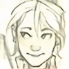
Prosper (c) ~AndThenYou
Blaire (c) me
ps. please stop asking me if these characters are from a book or movie. they're my sister's and my original characters.
so. Blosper officially gets a webcomic. OFFICIALLY.
this means a few things:
-it will be updated bi-weekly, or, if i'm feeling up to it, weekly.
-the story will finally be told chronologically.
-you will find out how Prosper got his scar.
-most of it will be written by Clare, alternately ~AndThenYou, with some of her old stories thrown in. (Ferris Wheel anyone?)
-it begins with their graduation, they will already have been dating. ends with the wedding.
THIS HAS TAKEN WAY TOO MUCH PLANNING. dear lord, the info i've had to gather for this fictional couple. pah.
Prosper (c) ~AndThenYou
Blaire (c) me
ps. please stop asking me if these characters are from a book or movie. they're my sister's and my original characters.
Image size
1673x2156px 1.55 MB
© 2011 - 2024 burdge
Comments554
Join the community to add your comment. Already a deviant? Log In
While you're a very good artist, Burdge, I feel this piece is somewhat lacking in your usual level of creativity and technique.
First off: The title with the marker edging doesn't flow well with the rest of the image. With the bright blue of Blaire and Prosper's clothing, it just doesn't look right. Not to mention the color inside the marker looks a bit...strange. Instead of edging the title in marker to give it emphasis, it would have looked nice to take a bright color from the drawing and use that with no marker. It would have created more flow throughout the entire image and tied it together better.
Blaire and Prosper: They seem much too posed. Have them interacting with the drawing in some way. Maybe holding a box or sitting on one? Anything to make them seem part of their surroundings and not just to figures stuck on a stage.
Boxes and floor: These ended up pretty good. I love the 'This side up.' I do find it unlikely that they'd be stacking boxes in front of a doorway. I also think that if we had been able to see the bottom of the doorway, it would give more depth to the image. I had actually thought that the wallpaper in the next room was some kind of door or something. It just didn't identify as an ongoing room.
Rest of the kitchen: The green on the walls looks a little strange, as in people wouldn't normally choose that color for walls. The cabinets definitely could have used more texture to them. I'm guessing you were aiming for a cheap cabinet kind of look? It just needs a bit more texture.
Overall, the image has great potential and is pretty good. The composition and color scheme falls short though. I've seen other works of yours and they don't seem to be suffering from these problems, or at least not as much, so maybe it was just the nature of this drawing that caused it to have these problems?
I hope I helped.